Certain rooms feel expensive before you notice a single piece of furniture. The trick usually isn’t scale. It’s weight. Thick glass. Stone that looks cold and dense. Metal that catches warm light without turning flashy. In a dark lounge, barware works the same way jewelry works in tailoring: the room looks more finished because the small details are doing real work.
You also don’t need to drink to use barware well. A decanter, a tray, a pair of glasses, and a set of proper coasters can make a sideboard or console feel deliberate instead of under-styled. The difference is restraint. A good lounge corner looks edited. A bad one looks like an airport whiskey shop exploded in it.
If the room still feels thin at the furniture level, solve that first. Heavy Leather & Ash Wood: The Core Lounge Furniture covers the heavier silhouettes that make these smaller accents look believable.
Start With Materials That Carry Low Light Well
Barware only looks expensive if the materials survive warm, low light. That rules out most shiny chrome sets, novelty finishes, and thin clear glass. The most reliable palette is simple:
- Smoked glass: darker, quieter, and more forgiving under 2700K light.
- Muted brass: warm and soft, not mirror-bright.
- Black stone: marble, slate, basalt, or anything with enough visual mass to slow the eye down.
Once those three materials are in the room, everything else gets easier. The bar surface starts reading intentional instead of decorative.
Think In One Surface, Not A Whole Bar Cart Fantasy
Most people overbuild this. Unless you’re actually making drinks for a room full of people, you do not need a full “bar setup.” One surface is enough: a console edge, a sideboard corner, a small tray table, or the back third of a walnut side table.
The goal is a ritual, not inventory. A place to set one bottle, two glasses, and whatever catches the light. That’s what feels grown-up. The rest is retail theater.

The Bottle Matters Less Than The Shape
You can chase labels if you want, but visually the bottle shape matters more than the prestige story. Dark glass, thick shoulders, a clean label, and a silhouette that still reads well in shadow will usually look better than a famous bottle with loud branding.
If you want a safe visual shorthand, look for bottles that feel heavy in profile: darker Scotch presentations, clean Japanese whisky bottles, certain cognac or brandy shapes, and aged rum with old-world label language. The honest rule is this: pick one bottle you’d actually keep open, not five props you don’t care about.
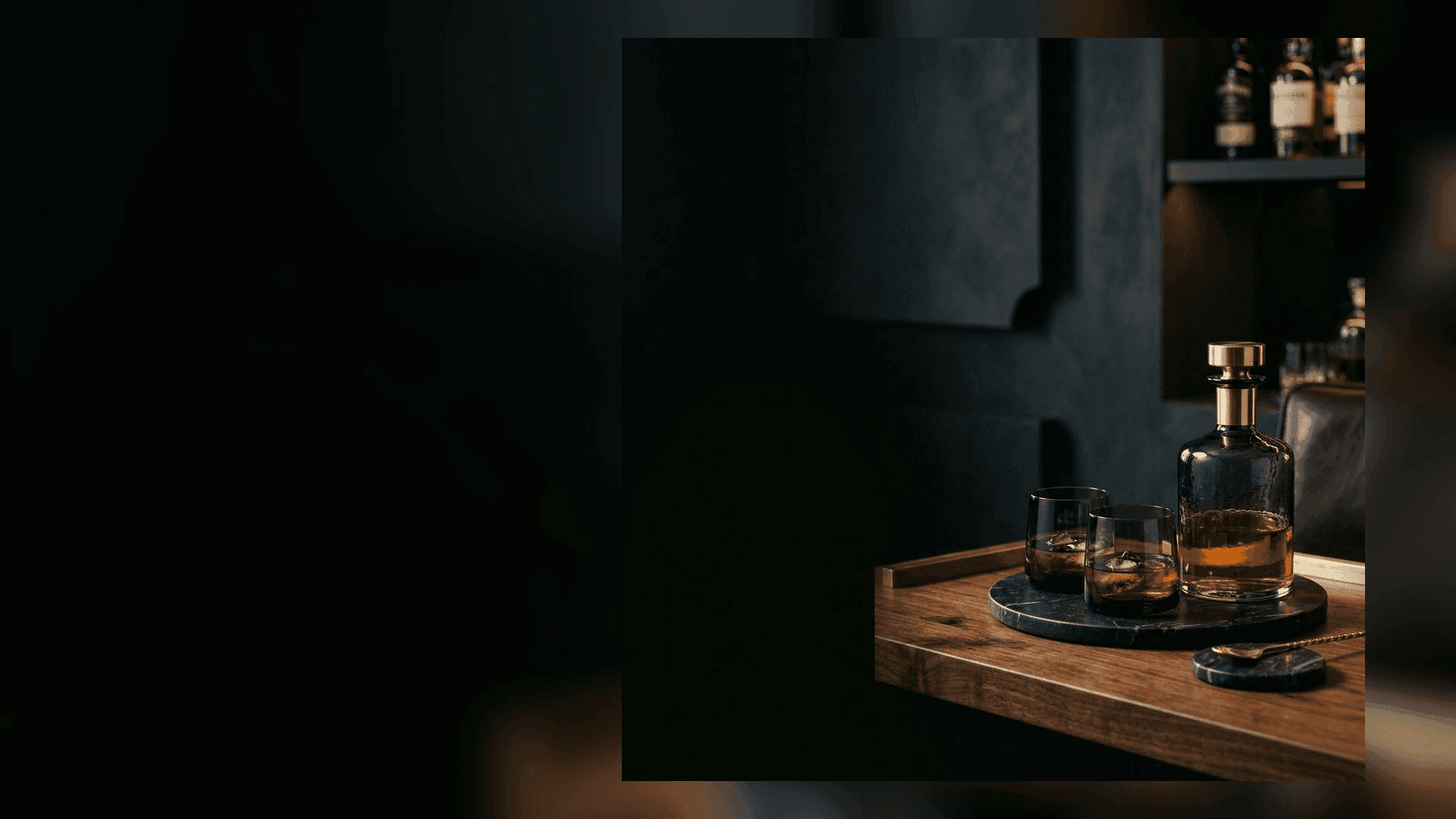
Use A Decanter Like A Focal Point, Not A Centerpiece Contest
A decanter works best when it behaves like one focal object. The room does not need two cut-crystal decanters, six tumblers, and a brass shaker set fighting for attention. Give the main object space around it and let negative space do some of the design work.
If the decanter is heavy enough and the tray is right, the whole setup starts to feel architectural instead of decorative. That’s the difference between “barware accents” and a shelf of random gifting ideas.
Glassware Should Match Even If The Room Doesn’t
Matching glassware is one of the easiest ways to make a room feel composed. You can mix furniture eras, art styles, and textures, but a random collection of glasses always reads accidental.
If you actually drink whiskey, proper tasting shapes are worth it. If you care more about atmosphere, smoked tumblers and thick lowball glasses tend to look better in a lounge. The important part is consistency. One glass profile repeated twice looks intentional fast.
Coasters And Trays Are The Quiet Quality Check
Cheap coasters can undo the whole effect. Stone, black marble, slate, or dense composite surfaces instantly read better because they feel colder and heavier than cork or printed board. The same goes for trays: a tray is not there to decorate the surface. It is there to contain it.
Keep the tray edited: bottle or decanter, two glasses, coasters. Maybe one brass lighter or match holder if the room actually uses candles. Stop there.

Light The Glass, Not The Whole Room
Barware dies under overhead white light. The room can stay dark. The glass just needs one warm source catching an edge. That’s why these setups work best beside a lamp, under a soft shelf light, or in a corner where a 2700K practical light can skim across the bottle shoulders.
If you need the full blueprint for that, use The Ultimate Guide to Dark Lighting Displays. The barware itself is a finishing move. Lighting is what makes it believable.
Keep The Metals Soft And Skip Chrome
Chrome reads kitchen. Polished gold often reads gift shop. In this aesthetic, the safer move is muted brass, smoked metal, matte black, or anything that feels worn-in rather than mirrored. You want the hardware to pick up the light, not shout back at it.
If the space still feels unfinished, pull back and solve the room itself with How to Create a Moody Lounge Corner. Once the corner is structurally right, the barware almost places itself.
What Usually Makes It Look Cheap
- too many bottles on display at once
- thin glass that disappears under low light
- mirrored gold or chrome finishes that feel kitchen-adjacent
- novelty signs, jokes, or “speakeasy” props doing too much

Bottom line: good barware should feel like a small set of tools with visual weight, not a themed display. Buy fewer pieces, keep the finishes restrained, and light the glass properly.
Recommended Barware
These picks match the materials in this guide: smoked glass, dark stone, and glassware that reads premium in low light.
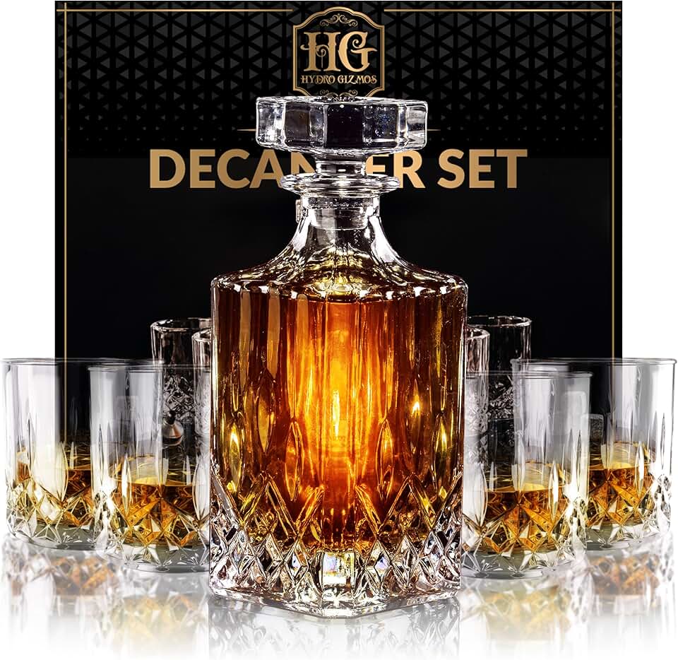
Smoked Glass Whiskey Decanter Set
A simple way to add weight and highlights in low light. Look for thicker glass and clean silhouettes.
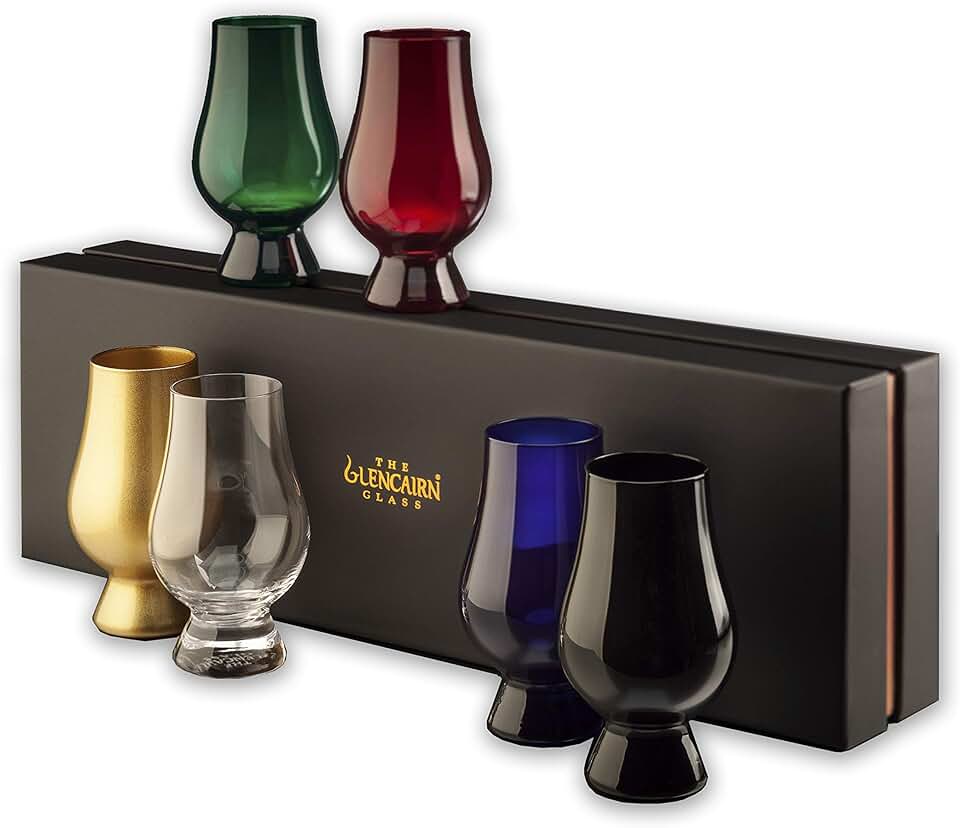
Black Whisky Glass Set (Dark / Smoked)
Matching glassware reads intentional. Dark or smoked glasses look better in a moody lounge than clear, thin sets.
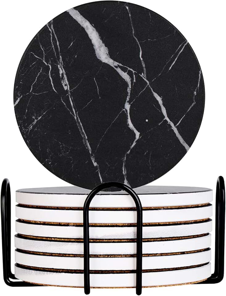
Black Marble Coaster Set
Stone coasters are the quiet tell. They make the bar surface feel cold, heavy, and intentional.

Armand Black
Founder & Lead Editor. Obsessed with high-contrast design.